We are now less than a week away from the Eurovision final 2012! Which is a very exciting thought.
Today I thought I would look into the Eurovision branding, themes and little slogans that are now an important factor in the yearly spectacle, but that were only really introduced in 2002.
Before then, there had been various logos used, but the themes and slogans only really started to be a big element of the contest in Estonia in 2002, when they introduced their slogan, "A Modern Fairytale," with this logo:
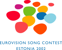
I was eight when this contest took place, and all I can really remember was the female presenter boasting that Estonia was the only country in Europe beginning with an "E". And I remember thinking, what about England? But I suppose politically, and Eurovision-wise, we're in the UK.
To be honest, "A Modern Fairytale" sounds a bit odd to me, and I don't really see what it has to do with Eurovision. However, this magic, fairytale kind of thing seems quite popular with the Baltic countries, what with Latvia the following year having,
"Magical Rendez-vous"
Finland in 2007 having,
"True Fantasy"
and Russia in 2009 having,
"Fantasy Bird"
(and it is ironic that this contest was won by a song called, "Fairytale" - from Norway, another Baltic nation!)
I must admit, though I didn't think much of the bird logo when I first saw it, it has certainly grown on me, and I now think it's quite pretty, and the colours are lovely - they look especially striking against my blog background, which makes a nice effect.

I can't say for sure, but it looks like it was the 2004 competition, with the above logo, when the standard Eurovision emblem, with "Eurovision" written in script with the country's flag in a heart for the "v", was first used. There wasn't any other individual emblem that year from what I can find, but they did have a motto - "Under The Same Sky," which I think is a lovely idea because it adds to the impression that people all over Europe are united through Eurovision.

The logo of the 2005 competition in Kiev in Ukraine carries on the "Eurovision" and flag theme, and also has a twirly thing which looks like a shell and which may represent the layout of the city (?) but other than that I can't think of any other explanation of it, and I can't find anything on the Internet about it.
In 2006 we had this logo from Greece - and I must point out that the multicoloured squiggles are meant to be - I presume - the readout on a sound-meter - possibly also a heart monitor - and the resemblance is much more apparent when watching it dynamically on a video clip from the competition.
I like it, but I don't think it's the best we've ever had. Their slogan was, "Feel The Rhythm," which sort of goes with the emblem and graphics, and which is a nice idea, but again not awe-inspiring.
Finland in 2007 I have mentioned - True Fantasy - and I love the way they managed to tie this in with Krisse - an amazing Finnish comedienne who presented some of the Eurovision coverage that year. I have a blog post on her; if you would like to see it look at the blog archive; it's the third Eurovision one from the bottom.
I don't like the graphics though - a bit psychedelic for my liking - but at least they tried to create their own identity within the wider Eurovision franchise, which I like.
They also had their interestingly-shaped stage which according to Wikipedia was supposed to look like a kantele - a traditional Finnish musical instrument. However, I'm sure I remember hearing on the commentary that the large arching thing on the stage was supposed to a whale's bone, or something like that... so I don't know.
2008 was Belgrade in Serbia, and they had possibly the most interesting logo and tagline of all:

I personally don't find the stark red and blue very pleasing on the eye, but I really like the premise behind it all which is that they are linking the contest with the fact that Belgrade lies on the confluence of two rivers, the Danube and the Sava, hence the idea of "Confluence of Sound."
Their stage also reflected this, with two graphical "rivers" flowing down onto the stage and then meeting and flowing together; this is a nice concept but again I didn't personally find it very pleasant to look at. However, I applaud Belgrade for coming up with what was easily the most innovative yet logical concept yet.
Moscow in 2009 and their Fantasy Bird I have mentioned; next was Norway in 2010 which, as I've mentioned before on this blog, was one of my favourite Eurovision years.
I've spent a lot of time watching and re-watching videos of songs from this particular competition; therefore I've become very familiar with their "Share the Moment" motto and their little bubbly logos.
This particular contest was all about sharing and unity; probably best signified by the interval act of the flash mob with people all over Europe taking part; united by music and dance.

2011, last year, the competition was in Düsseldorf in Germany. I really enjoyed their hosting of Eurovision as a whole, but I was slightly put off by their emblem of a neon heart pulsing rather too graphically and realistically for my liking - and with sound effects. I faint at the sight of blood and a pulsing heart is not the sort of thing I want to see on a regular basis throughout the broadcast of Eurovision.
Their motto was, "Feel Your Heart Beat!" which kind of fits in with it nicely, but which isn't my favourite Eurovision slogan ever.
To be honest, I don't know what is my favourite slogan - probably "Under The Same Sky" in Turkey in 2004. But the theme I admire the most has to be Serbia with their "Confluence of Sound," and how far they managed to work with the concept so that it almost defined their hosting of Eurovision.
And this year? We are in Baku, Azerbaijan, with the slogan, "Light Your Fire!" and this logo:

I think it is very pretty, and I am interested to see how the concept will pan out, and how far they will take it... obviously short of setting the place on fire.
I do think it is a good theme as a whole, and it reflects the country - the so-called "Land of Fire," and also the Eurovision spirit as a whole; that there will hopefully be something for every individual that will "light their fire" so to speak, and make them feel happy.
So overall, I feel that the idea of individual themes, logos and taglines for each year is good because it helps to give each year's competition an identity of its own, as well as reinforcing some of the values of the main Eurovision phenomenon.
Thanks for reading.
Bring on Baku! Two days until the first semi-final!
Liz x
No comments:
Post a Comment